Differences between Arial and Helvetica
Contents
Arial vs. Helvetica[edit]
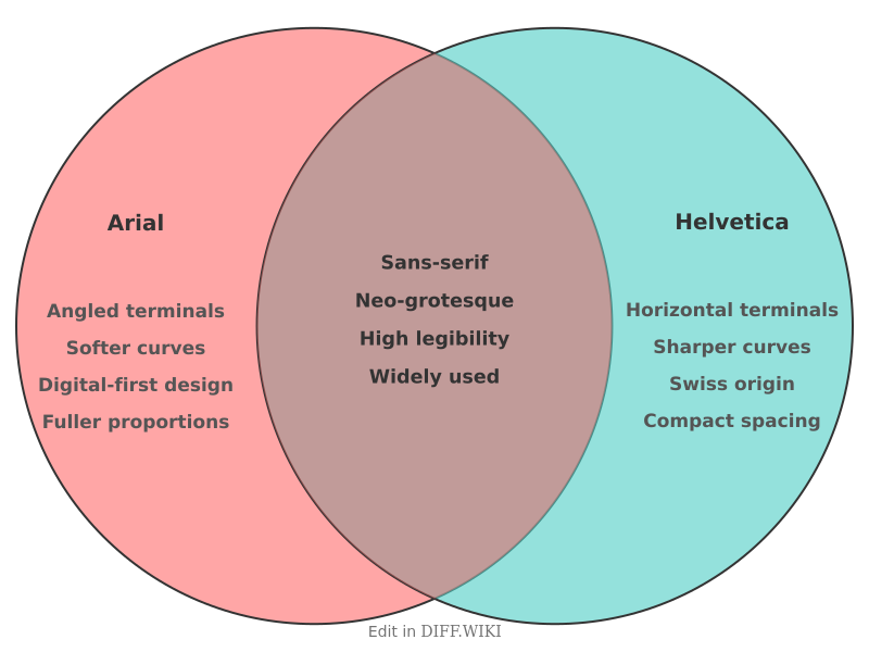
Arial and Helvetica are two widely used sans-serif typefaces that share a similar appearance, leading to frequent comparisons and debate among designers and typographers.[1][2] While both are classified as neo-grotesque, they originate from different design traditions and were created for distinct purposes.[3][4] Helvetica, developed in 1957, is a product of the Swiss Style of graphic design, which emphasized clarity and neutrality.[5] Arial was created in 1982 by Monotype as a font for high-resolution laser printers and was later included in Microsoft's Windows operating system, which contributed to its widespread use.[1][3]
The two typefaces are metrically identical, meaning that the character widths are the same, allowing a document to be reflowed with either font without changing the layout.[3] This was a deliberate feature of Arial's design. Despite this, several subtle visual distinctions exist between them.[1]
Comparison Table[edit]
| Category | Arial | Helvetica |
|---|---|---|
| Creator & Year | Robin Nicholas & Patricia Saunders, 1982 | Max Miedinger & Eduard Hoffmann, 1957 |
| Design Origin | Based on Monotype Grotesque, designed for early laser printers.[3][4] | Based on Akzidenz-Grotesk, part of the International Typographic Style.[2] |
| Stroke Terminals | Often cut on a diagonal, giving a softer appearance.[3] | Strictly horizontal or vertical, creating a crisper look.[1] |
| Capital 'G' | A simple vertical spur connecting the curve to the crossbar. | A distinct horizontal spur at the bottom right of the crossbar. |
| Capital 'R' | The leg is a relatively straight diagonal. | The leg is a curved, slightly flared diagonal. |
| Lowercase 'a' | A two-story character without a tail, having a smooth curve at the bottom.[1] | A two-story character with a distinct tail and a sharp angle at the bottom of the bowl.[1] |
| Lowercase 't' | The top of the ascender is cut at an angle. | The top of the ascender is cut horizontally. |
| Distribution | Widely distributed with Microsoft Windows and other software.[3] | Licensed commercially; became a core font on Apple operating systems. |
History and Development[edit]
Helvetica was designed by Max Miedinger with Eduard Hoffmann at the Haas'sche Schriftgiesserei (Haas Type Foundry) in Switzerland. Originally named Neue Haas Grotesk, its name was changed to Helvetica in 1960 to make it more marketable internationally, derived from "Helvetia," the Latin name for Switzerland. The design was intended to be neutral and clear, without any intrinsic meaning, making it suitable for a wide range of applications. It quickly became a hallmark of the Swiss Style of design.
Arial was designed in 1982 by a ten-person team led by Robin Nicholas and Patricia Saunders at Monotype.[1] It was created for IBM's 3800-3 laser printer.[3] The design was influenced by Monotype's earlier Grotesque series.[3] In 1992, Microsoft chose Arial as one of the four core TrueType fonts for Windows 3.1, which led to its ubiquity.[3] The decision was partly based on creating a functional equivalent to Helvetica to avoid licensing fees, although the development of Arial itself was a significant investment.[1]
Design Characteristics[edit]
The most notable differences between Arial and Helvetica are found in the details of their characters. Helvetica's design features horizontal or vertical stroke endings, contributing to a more structured and mechanical appearance.[1] In contrast, Arial's terminals are often cut at an angle, which results in a softer and more rounded feel.
Specific characters clearly show these differing design philosophies. For example, the capital 'R' in Helvetica has a curved leg, while Arial's is straighter. The capital 'G' in Helvetica has a prominent spur, which is absent in Arial. The lowercase 'a' in Helvetica has a tail and a right-angled stem, whereas Arial's is a smoother, continuous curve.[1] These subtle distinctions, while not always apparent to an untrained eye, are significant to designers.
References[edit]
- ↑ 1.0 1.1 1.2 1.3 1.4 1.5 1.6 1.7 1.8 1.9 "4over4.com". Retrieved November 27, 2025.
- ↑ 2.0 2.1 "pimpmytype.com". Retrieved November 27, 2025.
- ↑ 3.0 3.1 3.2 3.3 3.4 3.5 3.6 3.7 3.8 "wikipedia.org". Retrieved November 27, 2025.
- ↑ 4.0 4.1 "creativepro.com". Retrieved November 27, 2025.
- ↑ "wideview.tv". Retrieved November 27, 2025.
